The Goose
Identity, stationery and website design for The Goose; a secondhand bookshop on the Isle of Wight.
thegoosebooks.com—
The Goose has been on St Helens green, on the Isle of Wight, selling books to locals and holiday-makers alike, for over 35 years. Named after the gaggle of geese that once guarded the village green from excise men and interlopers, it is now a lot more welcoming.
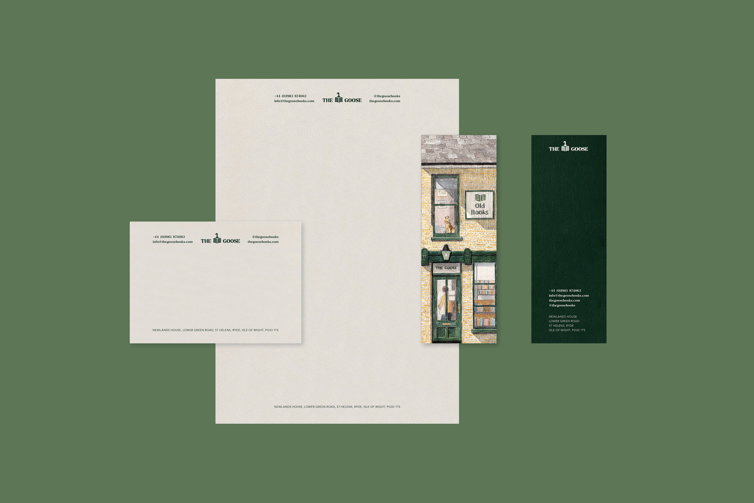
The studio worked with Kate, the shop owner, to ensure the brand identity captured the spirit of the shop and the community surrounding the village green. This was achieved by including Zoë Barker’s illustrations throughout the collateral, signage and on the website we designed.
The logomark is fun and full of character and sits alongside a more traditional serif typeface, to ensure the rich history of the brand shines through when paired with the endearing goose engrossed in a fascinating hardback. The primary colours palette comprises heritage English colours, that were chosen to compliment the traditional shop front and signage. The shop signage was completed by the very talented K. Harper Signs.
The e-commerce website is a simple celebration of the books themselves, Zoe’s illustrations and the expanded brand colour palette. The books are placed on coloured tiles, which allows them to pop and sing, all before they are purchased, delivered and even read.


